By Leah Coppella
Photos by Chris Roussakis
In the late 1960s, universities in the United Kingdom were a hotspot for rock bands. An alternative venue to nightclubs, university stages were a platform for bands in their infancy, propelling some of them to fame.
Soon the legendary Led Zeppelin would form, major acts like the first incarnation of The Animals would disband, and there would be short-lived successes for others.
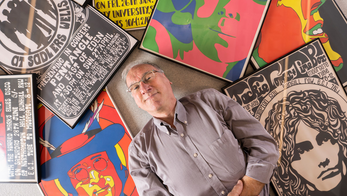
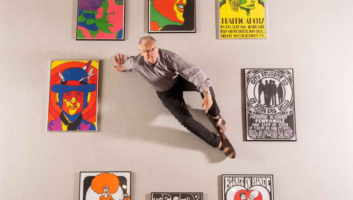
In those days, Brian Burns was attending City, University of London and the Central School of Art and Design as an engineering student. He’d been interested in music and art from a young age, so when he was approached to design a poster for an upcoming university dance, Burns didn’t hesitate.
“It was the ‘60s and there were rock bands and we were in London!” he says. “I was a London lad and it was cool.”
Soon he was creating posters for universities across the city.
Now the MacOdrum Library at Carleton University will be displaying the posters in an exhibit starting Sept. 16, 2019 and running through November.
Burns came to Carleton as a visiting professor in Industrial Design in 1980. He was the first coach of the Carleton soccer team and, after over 30 years teaching, he became director of the Institute of Environmental Science. Even though Burns is retired, he still works with the Technology, Society and Environment program and continues to do what he did in the 60’s… make iconic posters.
Making Iconic Posters
Burns says that one band that wasn’t big at the time eventually became Roy Orbison’s backing band for the next 20 years. When Burns first started, he created a poster for a show at Northampton Hall featuring Hopscotch and The Playground. The poster stands out in a vivid blue and brown negative with the words “SO COME!” across the bottom. The members included Hamish Stuart, who would later join Paul McCartney’s Wings, Mick Strode, who had recently left Robert Plant, and John Bonham, who would later form Led Zeppelin.
“It was just that period,” he says. “There were a lot of big bands there who relied on colleges and universities to launch, they were big venues.”
For Burns, exploring the medium was the best part.
“It was silk screen, hand-cut silk screen,” he says. “And we had no money, so it had to be one or two colours only, I loved exploring that within the technique, so that I could get the maximum out of it.”
Burns’s posters were originally screen-printed onto standardized poster paper. Each poster typically ran in quantities of 100 and because most were placed in public spaces, many have been damaged and destroyed.
Burns recalls the time he was asked to create a poster for The Who in two hours.
“There was no electronic media then, so when I did The Who poster, all I had was a really lousy scrap of black and white photo from the music paper of Pete Townshend,” Burns says. “We had to just draw everything, I had nothing to work from.”
The ‘60s Vibe
The posters have a definitive ‘60s vibe. One for The Zombies is arranged with crimson red and amber in an art deco style. A poster for the College of Birmingham featured the band Cream – wit Eric Clapton, Ginger Baker and Jack Bruce. Their hits “Sunshine of Your Love” and “White Room” were big in North America. Burns’s poster for Jimi Hendrix is bordered in a vibrant yellow, accented with a rendering of the musician’s gaze in burnt orange.
“When I’m drawing, I like to try to make every shape have a character of its own.”
Burns knew at the time that he was in a pivotal moment in music history,
“Around the early ‘60s, people went to dance,” Burns says. “But once rock became big, people started to stand and watch.
“That’s when people got very discriminating about what they were wearing, whether they were cool or not based on the instruments they played, or how they moved,” he says. “It was all very petty, but watching was how you could tell what kind of band they were.”
According to Burns, the evolution of the British rock scene was kickstarted by student unions who decided to host the bands.
“We were in the student union one day and Bob Dylan’s producer showed up with his guitar, saying he’d been booked to play some songs,” he says. “He hadn’t. We didn’t know where he came from or who booked him because it was that casual. So, he played.”
While Burns may have left most of his poster-making days in the past, today he still creates portraits of musical icons like Elvis Presley and Billy Joel. A four-part poster of The Beatles he’s drawn hosts bright cobalt blues and purples with strong lines.
“To me this is who they are,” Burns says, gesturing to his art. He points at the poster of George Harrison in bold magenta. “He’s too pink though, that’s got to come down,” he laughs.
It still takes many hours to get a piece just right.
“It took me years to find an image that I thought was George,” he says. “I really have to figure out how I graphically summarize it and give it character.”
Although it’s been about 50 years since Burns started designing posters, he believes they still hold a lot of power.
“Universities were really a big part of developing these bands,” he says. “The stories of how they formed and had hits or disappeared is just fascinating and it’s cool to bring it back here.”
Burns is selling his posters online at bb1967.com. The original posters have been digitally scanned and are printed locally in Ottawa, hand-stamped and signed by Burns.
Friday, September 13, 2019 in Faculty of Engineering and Design
Share: Twitter, Facebook